Cover art, part 2
There's a strong current convention in 'girl'-type historical novels for the cover to feature a lady in period costume with her face partially or completely obscured (the headless gowned lady cover).
The equal and opposite convention in 'guy'-type historical novels, those that are presumably aimed at a male readership, is for the cover to feature an item of military hardware set against a faded-out landscape background suggestive of exotic locations (mountains and seascapes seem to be popular). Some examples: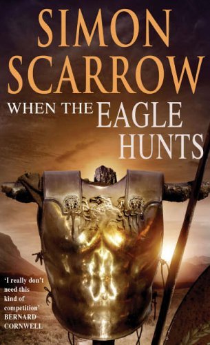
Simon Scarrow's Eagle series about the Roman army during the invasion of Britain in 43 AD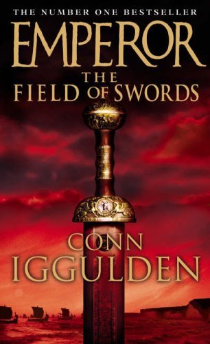
Conn Iggulden's Emperor series about Julius Caesar (it's pedantic to observe that Julius Caesar was the last Dictator of the Republic, rather than an emperor in the later sense)
Tim Severin's Odinn's Child about the Norseman Thorgeils and his travels through 11th-century North America, Iceland and Ireland
These covers promise an adventure story about soldiers and battles in far-flung places. The first two deliver that. Odinn's Child, despite the impression given by the cover art, is not a military adventure at all. I found it an enjoyable read (review forthcoming in due course), part 11th-century travelogue and part retelling of the Vinland Sagas, but heroic warrior epic it is not. The nearest Thorgeils gets to a battlefield is being knocked cold five minutes into the Battle of Clontarf. I remember reading it the first time round and wondering on every page when the big battle scene was coming, and having to go back and read it again on its own terms when I'd got to the end and worked out what kind of book it really is. Some months ago I got talking to a man in my local bookshop who was a great fan of historical military adventure and was looking for a new paperback that he hadn't already read. Since we liked some of the same things, we got to swopping book recommendations. He couldn't remember author names or titles, but he recognised books he'd read when he saw them. It turned out that he'd read almost everything in the shop - the entire Sharpe series (twice), all Colleen McCullough's First Man in Rome series, all of CS Forester, all of Patrick O'Brian, all of Simon Scarrow, all of Conn Iggulden, all of Manfredi, etc, etc (I eventually sold him Bernard Cornwell's The Last Kingdom on the grounds that it was Sharpe with battleaxes and Vikings instead of rifles and Frenchmen). The one title he did remember spontaneously was Odinn's Child. He'd bought it on the strength of the cover as his holiday reading, been very disappointed that it wasn't at all what he was expecting, and warned me not to buy it or anything else by the same author because "it's really boring, it goes on and on and nothing happens". As I said above, I wouldn't rate it so harshly myself, but I can certainly see what he meant - the cover promises a military epic and the content doesn't provide one. No wonder he was disappointed. So, okay, the cover got a sale, but it got a sale to a very unsatisfied customer who was now eager to warn off other potential purchasers.
Lest it be thought that I only ever carp about book covers, here are a couple that I really like.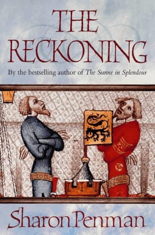
The Reckoning by Sharon Penman. The cover art captures the stand-off between Edward I and Llewelyn the Last that drives most of the book's action. And the blurb sets the romance element (Llewelyn's marriage to Eleanor de Montfort) firmly in its context as part of the story, without excessive emphasis.
The Lions of Al-Rassan by Guy Gavriel Kay. This is the 2001 Earthlight edition and I think it has much the best cover of the various editions on Amazon.co.uk. It clearly shows a confrontation between two cultures (and the architecture in the background tells you the cultures they are based on), in an opulent and sophisticated setting with a hint of a power vacuum (the empty dais). None of the individual characters dominates, although the key players in the story are recognisable. The detail hasn't come over very clearly in the picture but the original cover has a sort of jewelled complexity that suits the book very well.
Anyone else have a favourite book cover?

28 comments:
I'm definitely aware of covers (and have a definite idea - yeah, in my dreams! - of what I'd like on the cover of Catherine of Lyonesse). But now that you ask, I'm completely at a loss to come up with particular covers I like.
I am intrigued, though, by the conventions of the headless lady and the item of military gear. In both cases, perhaps the idea is to invite the reader to identify with the protagonist. The headless lady allows the presumed-to-be-female reader to put her own head on the gowned figure; while the presumed-to-be-male reader can pick up the sword or strap on the breastplate.
I'm glad you mentioned what Odinn's Child was really about because the cover is very deceiving. I saw it on Amazon UK and assumed it was another Viking adventure a la Cornwell.
Here are some book covers I really like. These books are currently sitting on my shelves face out.
Maria R. Bordihn's The Falcon of Palermo - because it says "medieval historical fiction" all over it, and these sorts of covers are very rare in the US. It's a biographical novel of Emperor Frederick II.
Kien Nguyen's Le Colonial - an almost dreamlike Asian-style cover. It's a literary adventure set in 18th C Vietnam (Annam).
Haven't read either yet, but I love the covers!
On the other hand, I think the US cover of Norman Spinrad's The Druid King is horrible.
Rick - That may well be the reason behind the conventions, a sort of role-play invitation. Also, as I said before somewhere, once a convention becomes settled it's an easy trouble-free option; put that up to the boss and they'll nod it through.
Sarah - Just the same as the man in the shop! (I wonder if anyone at the publishing house had actually read it?) I like the look of those covers too, especially The Falcon of Palermo. Is The Druid King the one about Vercingetorix? If so, I've seen it here where it has a much less vile cover. I put it back on the shelf though because 'Druid' has a tendency to put me off (read too many Arthurian fantasies that rely on ill-defined magic to fill in the plot). Am I wrong in this case?
I liked the cover you posted of The Reckoning. As you say, it gives an accurate sense of the book's content.
I find most of the headless lady covers visually appealing, especially if the lady is wearing a particularly nice dress. But although the publishers have succeeded in drawing my eye to the book, in most cases they haven't succeeded in getting me to buy the book.
Though I don't particularly like the actual book, one of my favourite covers is the first edition of 'The Kingmaking' by Helen Hollick, 1994. The chaps on it are actually wearing stuff that's OK for the 5th century (faints clean away in disbelief). I can't find a cover shot on the web to link to unfortunately. btw, the book is dedicated to Sharon Kay Penman ...
Carla - yes, Druid King is the one about Vercingetorix. I don't care much for the UK cover, either, since the bright red puts me off. It's another one I haven't read, although I distinctly remember the HNR reviewer calling it "an escapee from a fantasy imprint." That phrase stuck in my mind! So you may very well be right.
I'm not that particular about covers (maybe buying a lot via Amazon influences that, covers aren't what I look at first) but here is one I like. Mediaeval miniatures are fine, too, and some paintings. I have come across some very bad choices there as well, though.
Thanks for 'warning' me about Severin's books. I had them on my list but since I wanted guy-type books, I'd have been disappointed.
Because I like me some nice battles. :-)
Susan - why don't the nice dresses entice you to buy? Wrong historical period, or wrong type of book, or what?
Alex - I remember Helen Hollick's Kingmaking. Our town library is so used to Arthuriana = fantasy that it shelves her trilogy in the SFF section, which is most unfair since it's about the only recent version I've come across that explicitly doesn't feature magic and mysticism.
Sarah - thanks for the warning! My antennae appear to have been working correctly :-) I shall continue giving it a miss. The cover I saw wasn't bright red, though I can't remember what it was.
Gabriele - I like that one too, very understated. I'll post a proper review of Tim Severin's book when I get round to it, and that may give you more of an idea whether you'd like it or not. Although it's not a 'guy' book in the Scarrow or Cornwell sense and has no battle scenes to speak of, it's certainly not a 'girl' book either, and as far as I could tell it had a high regard for accuracy.
Carla--Usually I'll put down a book that had a cover which attracted me when a skim through it indicates that it probably won't be to my taste, usually because it verges too close to historical romance for my personal liking. Posie Graeme-Evans's The Innocent is one such example.
From my own experience of having the half-headless lady makeover and a headless man (!) I have to say that my sales have shot through the roof and into space since their inception. (i.e. the sales increase has been by the tens of thousands) They definitely do sell to the public at large, so there is something in it I'm positive. I do like this phenomenon myself and yes, they do attract me to buy. I think it's to do with being up close and identifying with the character, along with a feeling of texture. I adore this Jean Plaidy title and if I didn't already know Jean Plaidy and not particularly want to revisit her work, I would have bought this.
http://images-eu.amazon.com/images/P/0099493144.02.LZZZZZZZ.jpg The Penman cover you cited Carla, does nothing for me - although if i didn't already have it, I would buy it because it's Penman. Sarah, to me the Falcon of Palermo cover looks too much like a text book. Reminds me of Travels with a Medieval Queen.
The Druid King looks like something Tim Burton would cook up! I quite like The Colonia cover, but it doesn't give me an 'Oooh' moment. Not that struck on The Lions of Al Rassan either. It's nice, but staid and it doesn't shout 'Buy me!'
A cover I did fall for, several years ago, was Melvyn Bragg's Credo, which was done like a Medieval book with rows of cabochon jewels at the base. Don't know if there's an url to it anywhere though as the cover has now changed.
Helen Hollick. She called one version of The Kingmaking - the first hardcover as I recall 'The Purple Puke' and absolutely hated it, but I don't know if it's the one with the correct costume for the period.
Susan
Just goes to show how tastes vary! The headless lady covers don't do a great deal for me, I must admit. I think chiefly because they imply that the book is going to be centred on one woman - whether or not that's actually true. I wonder if the headless man is going to become an alternative convention? That would fit rather neatly with Rick's idea of inviting the reader to role-play the protagonist :-)
I suspect I'm out of step because I naively look at covers for an indication of likely content, which is not necessarily the case. No substitute for browsing the content and/or looking for the Author's Note!
Susan - The Kingmaking cover I like Helen also liked so much that the artist gave her the original artwork. So it can't be the Purple Puke!
Ian Mortimer's biography of Edward III, The Perfect King, has an interesting variation on the headless man theme--a armored man portrayed from the legs down on the front cover, and with his torso only on the back.
I don't much care for the headless-lady theme myself - unlike Henry VIII, I like my ladies with heads. But then, I am not the target market.
I don't know whether a headless-man counterpart will take off or not. My gut feeling is that the weapon or other military item serves just as well for men, inviting their avatar to pick it up without actually showing the avatar.
CC Humphrey's novel Jack Absolute features the half-headless man on the front - target audience both men and women but more towards men as far as I know. My husband has the book on his TBR, bought by me at an author signing, but neither of us has read it yet. I won't paste the Amazon url as it went strange on me last time with the Plaidy, but it's easy enough to find. I understand it's sold very well.
Susan
Well, the bunch of headless women novels written by this lady feature female protags and a strong romance element in all of them. No guy-books. :-)
I've read two by her and one by her husband who writes slightly more epic in scope but not much - decently researched, solidly crafted books, but nothing spectacular. The sort that gains a bunch of fans, though; a nice amount of reccurring elements and just the right measure of predictability to know the bad guys will get it and the girl will get the guy, without the books being copies of each other.
Funny, the link leads to only three of her books - let's try this one, it should have the complete list.
The second link worked, Gabriele. There seem to be a lot of them. Are they a series?
Rick - arguably Henry also liked his women with heads on, until they annoyed him :-) It will be interesting to see if the headless man cover starts to be used to indicate a 'guy' book that's perhaps less overtly military than the Scarrow-Cornwell-Iggulden style. I hadn't thought of it until Susan and Susan/Elizabeth mentioned the covers, but it might have been a more accurate indicator of the content for Odinn's Child than the helmet. Sort of implies a more character-driven story, where the reader is supposed to identify with the person rather than with the action?
BTW, Elizabeth Chadwick/Susan Hicks - by what name would you like to be called? Blogger posts your comments as 'Elizabeth Chadwick', but you sign your comments as Susan, and I feel a bit daft typing Susan/Elizabeth! What name would you prefer?
Actually, thinking about when I post here, although you all know I'm called Susan and it's what I call myself other than when I'm writing (Elizabeth Chadwick is a combo of my middle and maiden names, but when I started out there was also a cookery writer called Susan Hicks) perhaps I ought to be an Elizabeth, because Susan Higginbotham posts here too and was here long before me. Since we're both Susan H, it's still confusing. So, from now on, when I post here, I'll sign as Elizabeth!
Carla,
Die Kastellanin is a sequel to Die Wanderhure, but the rest are standalones. Several of her books feature women who have to disguise as men. My favourite is Die Kastratin about a women who makes a living for herself and her father by posing as catrate at a time women were forbidden to sing. It works fine until she falls in love and someone from her former life recognises her ....
Okay, Elizabeth it is!
Gabriele - there's a similar plot hinge in The Lady Soldier. I guess it's a sort of archetype - the past catching up with a character trying to live a new life.
The last book I bought mainly because of the cover featured a headless man (boy, really), wearing mail and holding a sword. 'Pagan's Crusade', by Catherine Jinks - about a character named Pagan living in Jerusalem at the time of the Crusades, not a pagan on a crusade. It is mostly character-driven, though obviously contains details of battles and what life was like as a squire at that time.
I quite like the headless gowned lady look, for the very shallow reason that I like pretty dresses :).
As for Odinn's Child - I agree with the man in your bookshop, in that I was expecting something totally different. I never finished it, though I'll try again.
In an interview (or somewhere), Conn Iggulden sid that calling the series 'Emperor' was the publisher's decision - it was originally titled something else but they didn't think people would understand it.
Looks like the headless man/boy to go with the headless lady may be catching on :-)
I guessd that would be the case with 'Emperor' - the author has little if any say on titles and covers. I wonder what the original title was? Did he say?
Thanks Ali, that's me off to Amazon to order Pagan's Crusade. Sounds like just my kind of novel and I love the cover!
I think he said 'Imperator', or something like that - the title given to a successful Roman general. 'Imperator' could be completely wrong, but I'm fairly sure it started with an 'I' :).
Elizabeth, I hope you like it!
Imperator would be exactly right. It's the origin of the modern word 'emperor' but it had the meaning you describe. If I remember correctly, if a Roman general won a major battle and his troops declared him 'Imperator' on the field, he was entitled to a triumph when he got home.
Carla,
I'm very interested in your observations here about the visual riff of military hardware and exotic vistas.
Helmets are very good subjects because they immediately identify place and period, and also "look at you" without there being anyone wearing them.
I have to say that this kind of imagery hits me like a sledgehammer between the eyes. The cover designers know exactly how to speak to someone with my mindset, as someone who reads historical fiction that has much to do with warfare.
I especially like ships. Bernard Cornwell's The Last Kingdom has Viking drakkars emerging from the sea mist and although it is a great story so far (I'm reading it currently) I pause to look at the cover for a few seconds every time I pick it up.
A ship is one of the most potent symbols possible for male oriented historical fiction. It conveys a mesmerising blend of beauty, fragility, technical complexity and power.
It both rules nature and is subject to its fury. It's elemental.
It grabs the male imagination and just carries it away.
Maybe pictures of military aircraft do the same for men who like Tom Clancy type thrillers, I don't know.
I don't mean "power" in a political sense, but in the sense of being free and in control of one's destiny.
One could get very psychological about this... but something about the sea is suggestive of passion too.
The covers say to me "This is going to have adventure in it, lads! Some serious blood and thunder is going to happen in here. Get aboard and get some!"
Hello Hazel-rah, and thanks for dropping by. Indeed, the covers carry just that message. With Scarrow, Iggulden and Cornwell, adventure is exactly what you get. With Odinn's Child, though, the book doesn't deliver what the cover promises (detailed review here if you're interested). A ship, especially a long-distance trading knorr rather than a drakkar, would have suited it much better, I think, since that would have promised travel to far-flung places (which it has) rather than blood-and-thunder battle scenes, which it doesn't have.
Post a Comment